
* * *
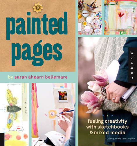
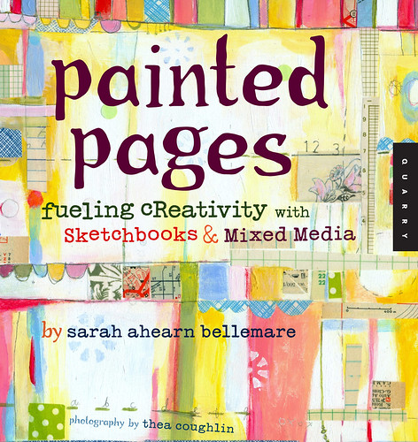
my book company, Quarry Books, and i are wondering which cover for Painted Pages you like the best? this week, the design team came up with the *new* cover (top image), and now we've been having second thoughts on which to go with ...
what do YOU think? we'd LOVE to hear your feedback and get your vote!
do you vote for the *new* or the "old"?
*new* is top cover shown here with photos
"old" is bottom image with painted background
if you have a sec, please leave a comment with your vote!
if you have two secs, please tell us why you like the one you've picked!
the choice for the cover is one of the last steps in this long process, and then the book goes off to print early next week! hip hip hooray!
it's so exciting to see things wrapping up with this book, and i just love the idea that my readers and friends can have a vote in this whole process!
so go ahead and have your say! i would really appreciate your feedback!
many thanks!!! *s


I say go with the new cover. It shows more of the process. Seems a bit more approachable.
ReplyDeleteold! :) I like everything about the new cover except for the title block. It looks like it's on some kind of cardstock or cork board and it reminds me of a really old scrapbooking tutorial book...there's nothing modern or hip about it. If that one section was changed, I think I'd like the new version...because I like that it has such a clean crisp photograph (I'm a photographer). But that top left section kills it for me. I LOVE the old version and can't wait for your book to come out!!! :) Congrats!!!
ReplyDeleteOld! I love the organic, handmade feel to it.
ReplyDeleteOld. I think the old version is more eye-catching, and I love the bright colors and organic feel. The new version is nice but doesn't grab me in the same way.
ReplyDeleteI like the old one. Being an artist I gravitate towards the art - it would grab my attention from across the store. It really shows what one will find on the inside. The new one doesn't tell me as much up front, but maybe that is good too?
ReplyDeletethanks for your thoughts everyone! wow! i really appreciate it! keep 'em coming! xo *s
ReplyDeletepam- it's a fine balance for sure... do we give a sneak peek into what's inside or, like you said, show the artwork on the cover...
ReplyDeletei keep going back and forth!
thanks! xo *s
The old cover is *you.* And that is my pick :)
ReplyDeletexoxo
New. All the way.
ReplyDeleteI like the old one overall because it looks more like your work.
ReplyDeleteI love the new one! The photography is so beautiful and you get a better idea of what you are going to find inside. I have trouble buying books online when the cover doesn't give me an idea of what's inside.
ReplyDeletenew. for sure.
ReplyDeleteboth lovely but new is a bit more dynamic while still being you and showing us your style...
CAN"T WAIT!
New! New! New! My gut feeling about the original cover was the same as Anthropologie's -- that it didn't reflect the more sophisticated elements of your work. I love the new cover! It encompasses the Whole Sarah. =)
ReplyDeleteNEW! It makes me want to pick up the book more. I feel more inspired looking at the new one for some reason.I like the colors and I think it seems easier to read the little tag line and such!
ReplyDeleteGood luck picking! :)
forgot to add....i agree with cathy...the only thing i don't love on the new cover is how the title is done (it is a little scrapbooky).
ReplyDeleteoh boy! thanks everyone! i should disclose here that i vote for the *new* as it showcases thea's photos and gives a view as to what's inside...
ReplyDeletethanks so much everyone! xo
They're both attractive, but they say different things to me. The top one seems a little more grown-up and perhaps more serious about artistic practice. The bottom one seems more fun and child-like, perhaps with less serious content. Not knowing what the style of your book is, I'm not sure which is a better match.
ReplyDeleteI think the lower one is more in the style of your work, but the plonky typeface gives it a childish a feel, which I suspect might not be entirely appropriate. I'd suggest the imagery of the lower one, but with a more grown-up typeface like the upper one.
Overall, I'd say it's most important to have the cover match the style of the content because the cover sets expectations. So, not knowing the content it's hard to truly judge.
Oh, I just saw your comment (it must have been posted while I was writing mine)... if the new one represents the content/style accurately, then the new one all the way!
ReplyDeleteDefinitely the old one. I preordered it immediately as soon as you posted about it because I LOVE your work which is what will catch everyone's eye with the old cover.
ReplyDeletei love the new one. i think it would appeal to more people.
ReplyDeletethe old one is beautiful, but it is very focused on your own personal style.
Good Morning!
ReplyDeleteI vote NEW...
Love you,
Two Days in July
I would definitely pick up the new one first.
ReplyDeleteThe old one captures your personal style better, but I think perhaps the point of the cover is to give a clue as to the content and the new one does that better I think.
I also like the fonts in the new one better...more clean lines helps balance it out.
But I like them both!
New for sure. I do agree with one of the previous post, however, about the title background...kind blah...otherwise, it's sharp and eye catching. The old one is more eye-catching, appealing/comfortable for people who know you and your work,but since you're reaching out to a much wider audience and this book isn't work-specific, NEW it is! Love it!
ReplyDeleteI like the new one also, like that is shows the process, but like others have said, I don't like the New Title on the brown bag..
ReplyDeleteWishing you much success
New one. It's less busy, and from the standpoint of someone browsing at a store - I like being able to read the title quickly. It might be a little less exciting, but I think more people will pick it up and flip through. The quick glance test says NEW ONE. No question.
ReplyDeleteoh my goodness! thanks everyone! i SO appreciate you taking the time to give us your thoughts! yay!
ReplyDeletenew - looks more grown up and professional.
ReplyDeleteOld, old, old! I love your painting all over the cover. It is very inspiring for other artists to see!
ReplyDelete-Briana
+ the new one shows process, and also shows a bunch of ideas, which i think is a plus for this type of market. of course your existing fans will love your painting straight up, but for people who don't know your work, or people who would be interested in the subject material of your book but would put their own aesthetic spin on their projects, you may reach a broader audience with the new type of cover. it shows "potential" rather than "finished", which i think is the look of many of the best craft book covers. (simple sewing, printing by hand). It seems to me that you have several different potential customers with this book: your fans, people who pick up the book and like your own paintings/work, and people who pick up the book and like the subject material and how it is presented (gorgeous photos, ideas, techniques). would be great to appeal to all of these folks on the cover.
ReplyDelete+ lose the blue lines and focus more on the great photography and styling.
+ i agree that the title block takes away from the rest of the design. don't like the font or b/g. your handwriting would be great, maybe with a background that looks more like a sketchbook page and less like craft paper, or just use a color block behind the title. could you pull a photo from your shoots with thea that has a blank sketchbook in it and have the title look like it is written on the book, as you have tried to do with layouts inside the book?
I like the top one!I love collage and variety
ReplyDeleteStef
I'm more drawn to the new cover. Feels more elegant, I think.
ReplyDeleteIt's going to be great!
i like the new cover best :)
ReplyDeleteI prefer the old. It makes me just want to jump in and play. The other looks so serious to me.
ReplyDeleteI think they should change the title block in the "new" cover to look like the "old" cover if they could do that I would love it because it is fun the pictures on the new and the actual painted pages on the "old"
ReplyDeleteso hard to pick, but i'll go with the new one. i like the kraft paper background of the main title. good luck!
ReplyDeleteI like the new one. It would draw my attention on the shelf.
ReplyDeleteI love that your publisher is letting you do this, it is kind of unheard of - I think it is everyone author's DREAM to have say over their cover but most of us don't.
ReplyDeleteSarah, you know I adore you and I'm sooo happy for you and this book - I cannot WAIT to read it and work on some of your projects inside of it. You know I've been such a fan for years. You are the apple in my pie, baby!
As for the cover, the first one is great because it shows different aspects of Fueling Creativity -- painting, collage work, being out in nature capturing inspiration, all of it. The only thing is the typeface for the title doesn't appeal to me and I don't particularly like the borders images on the cover against that bright turquoise background, I think the background could be softer or some borders could be added to the images -- faint white lines, tiny dots, something...
But if they want you to tell them the top one or the bottom one, well I would say the top.
Okay I am going to go read through your other comments to see what the majority has ruled. I always avoid reading the comments on posts like this one until after I've given my opinion so as to not be jaded.
xo
Love ya,
Holly
I like the old best for sure. It has your eye catching art and style on it and the top or new one is more crafty looking in my opinion. :)
ReplyDeleteI like the old one much better. Much brighter, cheerful, eye catching. I would probably pick up the book with the old cover immediately, whereas the one with the new cover honestly doesn't grab my eye as much. It looks too much like every other mixed media book out there. I will still buy your book when it comes out though!
ReplyDeleteLove the new one!
ReplyDeleteCan't wait to hold your book in my hands...and...am so delighted to hear of a publisher giving an author so much say in a cover like this...to choose from two is fantastic!!!
Old! It's YOU and YOUR style. The one with the photos could be anyone's book cover.
ReplyDeleteHi Sarah! I sort of like them both!! Love the bright colors and format of the old one, but also love the personal photos on the new one. Maybe they could combine the two somehow?
ReplyDeletehmmm...a tough one. I think for the general public (by this I mean, including those who are not followers of your work)...the first one might be more of an inspiration to buy the book - in that they may not see themselves in your work but may in the generic lovely photos of paint, flowers with journal, the act of creating. I would be gravitated to the book with any cover but I am a big fan! :-) Best of luck with this!
ReplyDeleteI kept changing my mind too, but I think new, because it shows an idea of what's inside. I agree with the comments about the title section though; I don't think it does the rest of it justice. Good luck - I've already pre-ordered my copy over here in the UK!x
ReplyDeletethe second one (older design) would make me want to pick it up in a shop, much more than the first one (new one)
ReplyDeletehope this helps
MOnda
x
I love the new one! I love the addition of the photo. I can't wait to get the finished book!
ReplyDeleteI don't think you can go wrong with either one, but I personally love the new one! I think it draws you in more.
ReplyDeleteI like the new one, but it's a little hard to tell at a glance exactly what the book is about. The large photo with the flowers and sketchbook on the right draws your eye and overpowers the other smaller photos of your art. I'd like to see more of your art in the larger photo.
ReplyDeleteI love the original ( bottom ) . As an artist I would buy this one because it looks like it is more about the art .
ReplyDeletei like them both for different reasons, but i love the old cover. the original cover was the first thing i loved about your book. it's your art, always pulls at my heart. to me, the new one looks very similar to other books recently released and kinda like an 'artful blogging' magazine cover.
ReplyDeleteold cover. the new one is a bit too busy, and blocky. old one is very you.
ReplyDeleteHmmm... at first I said to myself, definitely old cover, because, well it's just so you. But I think now, after more thought,I'd suggest the new one. To me it does a better job of conveying process and seems more grown-up in a way. Not sure I like the kind of childlike font/typeface of the title on the old cover. Downside for me of the new cover is that I am not at all crazy about your title against the brown paper bag. It's a bit drab and flat and doesn't have sufficient pizazz! I am of no help at all! So exciting about the book! Miss you, xo Diana R.
ReplyDeleteI adore the top one because it speaks to the process and not simply the finished product as the bottom one does.
ReplyDeleteThe old cover would be something I would immediately pick up and look at, if I was in a bookstore. Or if I saw it on Amazon, I would want to look inside, for sure. I'm instantly drawn to it. It is definitely you!
ReplyDeleteThe second one looks more formal, and your artwork is small, not so noticeable. I'm not sure it will stand out on a book shelf.
old! it's fun and approachable...like you! if someone is buying a book to learn a process, they want to feel like it will be fun and that they can actually accomplish the techniques.
ReplyDeleteLindaBecky
I like the new. But I think the old is more like your art. How about combine the two. Put the top edging from the old onto the side of the spine of the new. The photo in the lower right is good, but does it represent the content and feeling you want?
ReplyDeleteSara
Love the new one Sarah! Can't wait to get mine...Diane
ReplyDeletei vote new! it's sophisticated and clean, and shows a creative lifestyle as well as the pages themselves. the old one to me looks like it's for a younger crowd - the painting is beautiful, but the combination of the bright colors and the font makes me less drawn towards it.
ReplyDeleteDefinitely old. The new one, while featuring pretty photos, looks like a generic mixed media book. The old one, since it features your art, is unique. Am not big on the title font for either, but it bothers me more in the new version. But I'll buy the book either way.
ReplyDeleteOld. It immediately grabs your attention. It makes me want to pick it up to see what is inside!
ReplyDeleteI like the original (bottom) cover the best. I like it because of the colors, and the style is definitely you.
ReplyDeleteyep-the old is undeniably you. the other, nice, but someone else.
ReplyDeleteYou could go with the new one too though. It is nice, except the bottom right picture reminds me of someone at a funeral. With their book/bible in hand and flowers to throw-really. If you put some of your art in there it might be a really nice marraige of the two covers.
ReplyDeleteold for sure. your style is what sets you apart : )
ReplyDeleteI love them both but I would say old.
ReplyDeleteI love old one. I jumped for joy when I saw it in your last post. It looks so inviting!!
ReplyDeletesarah:
ReplyDeletei vote new. reason being: old is SO you, but old is the prized finished look, and new is about the collective process. that inspires the average onlooker's curiousity, has them pick up the book, thumb through it, think of someone (or themselves) and them, {ahem!} throw it in the cart :)
SO happy to you---can't wait to get the book myself!
xoxox
stephanie
I vote for NEW because it also shows process, and that is what the book is really about. I love your artwork Sarah, and I hope that we get to see lots of it inside your book - but the new cover is much more graphic, easier to read and I think will attract more readers who aren't familiar with your work yet.
ReplyDeleteI also think it is a great idea of Quarry to get you to ask your blog followers :)
Cheers,
Stephanie
I vote for the old cover. It embraces the viewer in a more immediate sense and conveys a lot about your style. Of course, the new one is also nice and I will purchase the book either way...! Good luck choosing.
ReplyDeleteWowsers. This is hard! I would pick up either cover in the bookstore, but would expect to find things that spoke to me in the book with the new cover--there's a hint of variety, of depth, and challenges on that cover that I don't get from the old.
ReplyDeleteLove the old, because it's your work, and I love it, but it's you, and doesn't give a glimpse into the you I met as a teacher and guide.
The weakness for me in the new cover is the title block--what would it look like if the essence of the old cover were in that spot?
I like the "old" version, simply because it looks more hand-done and artistic.
ReplyDeleteSarah,
ReplyDeleteWe met at Squam, I loved your class. I have a picture I keep meaning to send.
I love the new cover. It looks very professional and draws you into the art. It reminds me of Artful Blogging which is so well done. Both are great, but the new one is really sharp and makes me want to look inside more than the other.
Hugs,
Susan
old - definitely, because it looks like it's actually made of painted paper.
ReplyDeleteOld cover with different typeface or new cover with different type and background. Sigh. Not much help there, am I? but I am off to preorder, regardless of cover....!
ReplyDeleteedie
I vote one thousand times for the NEW cover. It's much more eye catching (important for getting someone's attention on the shelf in the book store) and helps to show more of what the book's about. I find the new one more inspiring. The old one is ok, but I find the sUbtItlE's cRaZy lEtTeRiNg to be distracting. A cover should, in a moment, convey the meaning, idea, and spirit of the book in a single glance. I get it from the new one.
ReplyDeleteYikes. I like the art on the old one, but think the font could go. I like the new one, but the photo of the hand/bag etc, was a bit confusing to me. It took me a long time to figure out that it was a bag. Possibly that is just me though. Also, I think the brown behind the title could be changed... of course I think Thea's work should be showcased at all times, and so having her photos on the cover would be great! It just seems to be a bit of an unusual mix of bright and dark, but I love the concept. I love the old cover, but maybe it would make an excellent back cover. Could you have both?
ReplyDeleteSorry! I'm not much help. Your book is going to be a HUGE success no matter what! xoxox
Old, with no doubts. I wouldn't buy the new book, but the old one makes my heart sing.
ReplyDeleteCongratulations on such an accomplishment.
Nancy in Michigan
Here's my two-cents worth:
ReplyDeleteThe old cover does a much better job of marketing the contents, but perhaps could be ramped up a bit to reflect your wider range and more sophisticated style.
However, it is still far better at instantly informing a prospective buyer of the type and subject of the book than the new cover, so if someone is looking for a book on painting pages, they're more likely to pull the one with the old cover off the shelf and look inside than they would the one with the new cover.
At first glance, the layout and style of the new cover looks like so many DYI books for light-weight, cookie cutter home craft projects, and that's not at all what this book is about.
To those who know you, your book will sell with any cover. But a new, expanded audience of prospective buyers will walk right by a cover that has a format similar to scrapbooking and home improvement/craft books, unless that's what they're looking for. And if that's what they're looking for, they're probably not your market, and aren't likely to buy your book once they've looked inside.
came to your post from the craftside blog. i am not familiar with your work. when i am looking for books the old version would definitely draw my attention. the new one has the same look of so many other books. i probably wouldn't even give it a second glance. after looking at your work on flickr, i also think the old one is more representative of your style.
ReplyDeleteI love the new one best, minus the title block. Maybe if you substitute the old cover for the title block in the new one??? Something like that.
ReplyDeleteIf it is one or the other, then it is the old cover that would attract me. Big title, clear artwork.
ReplyDeleteThe new has wasted space with the big block of a clutched sketchbook and flower.
Maybe some of the "old" images or something similar could replace the clutched sketchbook image?
I like the old better.
ReplyDeleteThe old is more artsy and much better. The new looks like Martha Stewardy stuff - boring!
ReplyDeleteMy 2 cents:
ReplyDeleteI would be attracted to the "old" cover, I probably wouldn't pick it up with the "new" cover, not that I don't like it, but it doesn't really pull me in like the "old" one does. I think the photo's are too small/too many & the title is pretty not-exciting.
I've already pre-ordered it, so I won't be disappointed with either cover or even another choice!
I like both covers. But the new one is my favorite because it shows what the book is about, the process. This cover will bring in someone who is new to the craft.
ReplyDeleteI definitely like the OLD ONE. It's the one I'd want to pick up in my hands and page through. My heart is drawn to it and I immediatly feel that I want a copy to have of my own. I fell in love with it immediately when I first saw it. I love everything about it, painterly text and all. I find the new one a bit sterile. Not something my heart is immediately drawn to. I like the IDEA of the collage images and I like the pictures of your work and your work area, but the pieces/photos seem disconnected. The photos of your work, which should be the main focus, are too small. The overall feel of the new one seems a bit cold to me where the old one seems warm.
ReplyDeleteOLD It's fun and refreshing and still depicts 'the painted page' the new one kind of looks like a school book, and it is hard to see at first that the person in the image is actually carrying a bag and not wearing a smock.
ReplyDeleteThe new one, the old looks a little to "kids book" to me.
ReplyDeletePersonally, I like the latter or older one best. To me it tells more about what the book is about from looking at the cover.
ReplyDeleteBag the "new" cover, it stinks - it doesn't relay the title's message in the slightest. Go with the "old" cover. It's bright, it's bold, it's energetic, but maybe more importantly, it shows exactly what the book is all about - so important with a craft book.
ReplyDeleteI like the old one much better.
ReplyDeleteIf i walked into a bookstore and saw it, it would immediately catch my eye!
it's fresh, bright...
the new one not so much... it reminds me of so many other books...
i say go for the old.
oh my gosh... i am overwhelmed at the responses here! thank you ALL for your votes, ideas, opinions and more... i'm so thrilled, and am now getting more and more excited about this book coming out, as it seems that you are too! : )
ReplyDeleteat this point, the cover choice is certainly still up in the air! (have yet to "tally" those votes... )
thanks again everyone! i am so happy to hear from each and every one of you! xo *s
I love both covers, but when i must be think of which one will i open quicker in a shop i t hink the first because it shows more of the inside.
ReplyDeleteand i will then like to see to it.
And too of your style, which i like;-D
so that why.
wish you lots of succes with your new book.
good luck and have a great xmas time ;-D
I vote for the new cover. It looks "thought-out" and complete it brings some "order" to the process which I am assuming what the book will be about as fueling creativity takes a surprising amount of organisation. It looks like a sneak peak into the book
ReplyDeleteSarah, I say the old one. When I saw the preview on amazon with this cover - I knew before even reading it that it was yours. With the other one, I dont think I would have. It screams you and your style and it makes me want to pick it up. When I pick it up and explore, then I would see all the other pages and techniques that you want to showcase on the new cover. I think the goal of a cover is to get people to pic it up and this has done that.
ReplyDeleteCheryl
prefer the old
ReplyDeleteI like the new cover best for commercial purposes but the liveliness of the old cover has great appeal. Too bad you can't have one as the front and one as the back. The title block on the new one could use some chage in the background. Lighter? More of the playfulness of the old one? But, if it is down to making no more changes....the new one will tell people more of what the book is about.
ReplyDeleteOld! It is your style completely and it is eye catching and immediately you know it is something different than what is already out there. The new one reminds me of the 80s how to book style... too stuffy!
ReplyDeleteI really like the new cover....more sophisticated and beautiful. I am not sure I would buy a book with the old cover, seems primitive.
ReplyDeleteSandy White
www.quillingbysandrawhite.com
This might just be my first comment on your blog! I really like the new one (though I do agree with a few of the other comments about the typeface).
ReplyDeleteI'm just a sucker for studio shots... It feels more personal. A book with photos on the cover makes me think that there will be more of an insight into the artist and their process, rather than a book only full of the finished artworks, if that makes sense?!
But CONGRATULATIONS!!! How exciting :)
love the old cover! it is whimsical, eye catching and interesting.
ReplyDeletethe new cover is honestly blah and typical of how so many books look. good luck!
The new cover -- it clearly shows the variety of your projects. :)
ReplyDelete-- Birgit
I love the orig, the 2nd one here, more colorful.. and so much more eye catching!
ReplyDeleteI'd say the original would be perfect, perfect perfect if this were a book that was a coffee-table collection of your work. But as it's a book that's geared toward offering insight and instruction, the new one seems like a clearer snapshot of that goal. I do agree with the very first opinion, though, in that the type on brown paper is a little dated and bulky.
ReplyDeleteOLD - represents your work... At first I thought I liked the new one better! but after comparing them with a more critical look the OLD one represents what the contents will share with the reader...
ReplyDeletelet us know when it hits the bookshelves.
Old! It's enchanting. :)
ReplyDeleteI don't know you or your work - I just found your blog today and plan on checking it out. As a someone who has no preconceived notions I would say the new cover is more interesting. The "old" cover looks like many of the covers of visual/journaling books that have been published in the last 7 or 8 years. It doesn't stand out. When I go to the bookstore the covers of these type of books all look the same to me. The new cover looks less conventional. However, I agree with the others who didn't like the font on the new cover. I prefer the font on the old cover.
ReplyDeleteI just came across your blog. So far, I am delighted by your artwork.
ReplyDeleteI haven't read all of the comments regarding your book cover, but I think the new cover would make me more likely to look at your book. Upon scrolling down to the old cover however, I will admit that I immediately felt a sense of lightness and cheer when I saw it, whereas the new cover is so neat and tidy and... square!!
For purposes of advertising what the book is about, however, the new cover does a better job.
I might mention that I am more likely to buy a book if I can look at some of it's pages. I can sit for a long time looking at books in a bookstore and the contents of the books are what will be the deciding factor about which books I decide to purchase. If I am looking at a book online and I am unable to see at least some of the pages, I will not purchase the book.
So, it is unlikely that I would purchase your's (or any other artist's) book from an online book seller without a "Look Inside" option. This is a pet peeve of mine and I think that publishers who don't allow potential buyers a glimpse of the contents of a book are doing authors a great disservice.
Having said the above, I will be sure to check out your book at a bookstore, once it is published!
OLD!!!
ReplyDeletehow interesting to see there isn't a clear loser, both are winners.
(how could there be?)
I love the old cover because it looks and feels more like your work. I can't wait to buy it!!!
ReplyDeleteThey are both awesome covers... the old one really says mixed media but the new one also really shows you what the book is about which could grab the attention of people who are not your usual followers. A blend of the two would be even awesome-er!
ReplyDeleteboth are beautiful. you cannot go wrong, though in both i do not like the title fonts. the old cover speaks more of mixed media immediately & i am so drawn to it. (love your work!) the new cover, the images are stunning & i agree w/others that the brown title block loses interest & doesn't seem to fit the rest of the cover. maybe the light blue grid lines simply continue so that the top left corner is simply the clean blue; change the title font (even to the clean san serif) but "color" the title with your art. instead of centering the title in that block, off set it to create more diagonal movement guiding your eye from left to right.
ReplyDeleteoh, there are so many possibilities! this designer surely had tons of fun creating this one!
congrats!
julie
OLD!!
ReplyDeletelcox3@nycap.rr.com
Sarah you may have decided already but I couldn't resist the invitation to vote: NEW. All the way NEW. I love the first one, it's so YOU and your painting, but the new one actually tells what the book is about, and I think it will sell it even more than the original cover, it tells the story of your book/your art/your method, visually.
ReplyDeleteIt's difficult! If I was buying a painting the 2nd one would catch my eye, but the first one seems to be more indicative of what's inside.
ReplyDeleteold! it has bright colors which will grab my attention firt, if I was walking by a bookshelf. Plus it looks like it's textured so I'd want to touch it!
ReplyDeletei like the 1st cover :)
ReplyDeleteReally love the old cover and was drawn to it straight away. The papers behind the title back it up. The newer cover looks to me, like a more general craft book.
ReplyDeleteOld cover is just so you...but the reader may not know that until that read the book..so the new one will be better to catch new audiences.
ReplyDeleteGo with the "old" cover. Like others have said, that cover is SO you!
ReplyDeletexo
jeanne
Old! It is bright, creative,and eye-catching. The new version is too careful looking, and reminds me of a million other books already. The old is more original and I love the font too.
ReplyDeletei really like the use of your art on the bottom one, but I prefer the typography of the top one
ReplyDeleteNew. Though it's close. I love that the old one is your work, but find the cleaner look of the new one is more appealing in a book cover sense. Not that it matters, I'll be buying it no matter which cover you end up with! :-)
ReplyDeletegreat works
ReplyDeleteOld!!!! :)
ReplyDeleteI like them both but prefer the old one because as someone mentioned the title block on the new cover doesn't look that great. Can't wait for the book. When will it be out?
ReplyDeleteI like the old version best. It is interesting with the painted background. It immediately makes me want to pick it up and look inside. The new version does not do that for me.
ReplyDeleteGood luck!
i'd go with the new one. if i were judging the book by it's cover, i'd buy the "new" one. congratulations and much luck. grow love, suz. www.growstudiogallery.blogspot.com
ReplyDeleteI like the old cover best...it has your work on it...more colorful! If you do decide to go with the new cover...put the title over a photo of your art, like you did on the old cover. The photo of the hand carrying the flowers, etc. doesn't seem cohesive with the other photos to me.
ReplyDeleteOLD: I hadn't heard of you before today & your book (with old cover) popped up as an amazon recommendation. It was the cover that made me want to look inside. The (new) blocked one looks too staged & scrapbook looking & I wouldn't have even given it a second glance.......now that you have my 2c worth - I am off to explore your work! GOOD LUCK with your book!
ReplyDeletethe old. it definitely says "sarah ahearn."
ReplyDeleteThe old...I LOVE it...it's IS you :-) Exciting and fun and colorful! The new one seems bland and boring to me.
ReplyDeleteI like the new one...looks more professional, but yet..still colorful & eye catching! Good work!
ReplyDeletethe old/bottom one is FRESH! i would so buy it. the top one is same old, same old. been there, had that...blah, blah. good luck! :)
ReplyDeleteDefinitely the old one - it's more what the book is actually about and it's more unique too! The new one looks a bit forced or something...and I wouldn't be able to tell from the illustrations what the book was about.
ReplyDelete